Point of Purchase Displays With Strong Visual Impact
What’s the first thing you see when you enter a retail store?
Is it the signage (point of purchase display) and specials associated with items in “action alley” or is it a creative example of bulk stacking?
Perhaps you’re captivated by the high-tech elements of a POP display, and you’re interested in exploring it further.
This is a perfect illustration of the power of visual impact. You can’t afford to ignore these principles that are so vital for getting your point-of-purchase display noticed.
We’ve outlined some important elements for creating a POP display with a strong visual impact that is sure to capture the attention of potential customers.
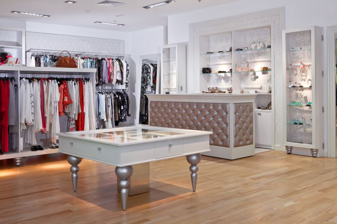
Use Care When Selecting Shelving
Is your shelving visually appealing? It is drawing your customer’s eyes toward your product?
Making a mistake when selecting your shelving can doom your display before it has a chance to reach consumers. Not sure what shelving is right for your project? Answer these questions:
Do you need a secure display? Theft costs retailers millions each year, and whether you’re selling power tools or the latest iPhones, don’t think you have to sacrifice style for the sake of security.
We can help you create a visually stunning and secure point of purchase display that will grab your customer’s attention.
Does your shelving reinforce your brand?
If your brand is high-tech but your shelving says vintage, you’re presenting a conflicting message that doesn’t align with your brand.
Does your shelving fit your available space?
Make sure your products aren’t crowded and that they are organized so that your potential customers can clearly see them. Remember that you’re supposed to prevent an overall, organized picture that draws their focus to your product.
Be Sure You Understand Your Product
Are you selling a product such as coffee? If so, your consumers are probably used to getting their coffee at the same location whenever they go to the grocery store. In this case, you only need to make sure your message is clear and concise.
However, if you’re selling a product that is more indicative of a lifestyle choice—for example, hiking boots—you may wish to create a visually stunning display featuring pictures of majestic forests and mountain peaks.
These will inspire potential customers, draw their eyes to your product, and tell a story that places your product front and center in their imaginations.
Remember that Less is More in a Point of Purchase Display
What do we mean by that?
We mean that when it comes to creating a visual impact, it’s easy to overdo it. By creating several different visual elements, they all compete with each other for your customer’s attention. The result is too much “noise” and your message is lost. You always want to be sure your gondolas and displays are dressed properly.
Often, simple principles of good layout and graphic design (like we explored in our earlier blog on the “Rule of Three”) will do more to create a solid visual impact than overloading your point of purchase display with bright colors and multidirectional signs.
Remember: keep your main focus on one element in order to keep from “watering down” your message.
Consider Bulk Stacking for Your Point of Purchase Display
Did you know that this can give your potential customers the impression that they’re getting a better deal? The result is bulk purchasing, and it’s a good way to create loyal customers.
Why does it work? In many minds, larger stands and displays are equated to sales and specials.
Bulk stacking is placing a large number of your products neatly in one place. An example may be a large display of the square boxes of soda cans, stacked similar to the way they are on a pallet. In terms of consumer psychology, this bulk stacking gives the impression of a better deal.
We encourage you to explore the aspects of bulk stacking and how your signage or POP display can complement your message. Not sure where to start? Don’t worry. Just contact us. We’ve got you covered.
Tell a Story Through Product Grouping
Consider this: Your company is selling a new grill just in time for summer backyard cookouts. You could simply do a plain display explaining the benefits of your product, or you could tell a story.
Stories stay in your customers’ minds for much longer.
So instead of merely having a grill as the center of your display, create an outdoor scene that may include grill utensils, charcoal, and other times that would be used for a cookout.
By doing so, your customer is able to picture themselves in the display, imagining what their own backyard barbecue could be like.
Make Sure Your Lighting Enhances Your Point of Purchase Display
Of course, the most creative, visually stunning display isn’t worth anything if your customers can’t see it.
Carefully placed lights, including LED lighting, can highlight your promotions, specials or even high-tech items. Remember that lighting can easily be used as a focal point, causing customers to linger longer at your display or trade show booth.
Using different shades or warms colors can also have a psychological effect on consumers.
Want a Display With a Strong, Visual Impact? We’ll Help You Proclaim Your Message
You want to stand out from the crowd. You want to rise above the competition. You want to capture your audience when there are hundreds of other businesses vying for their attention.
We understand. Our goal is not only for you to succeed, but for us to exceed your expectations.
Whether you have a clear vision for your product or you have a vague idea you simply sketched onto a napkin, we have the creativity and engineering to make it all possible. Interested in learning more? Please contact us for a quote.
Since 1977, McIntyre Manufacturing Group has created custom-designed displays with an uncompromised dedication to customer service. We utilize the latest technology and attention to detail to create the finest products with excellent craftsmanship. If you can dream it, we can create it. Contact us to see how we can bring your vision to life.


