Complete End Cap Display Guide
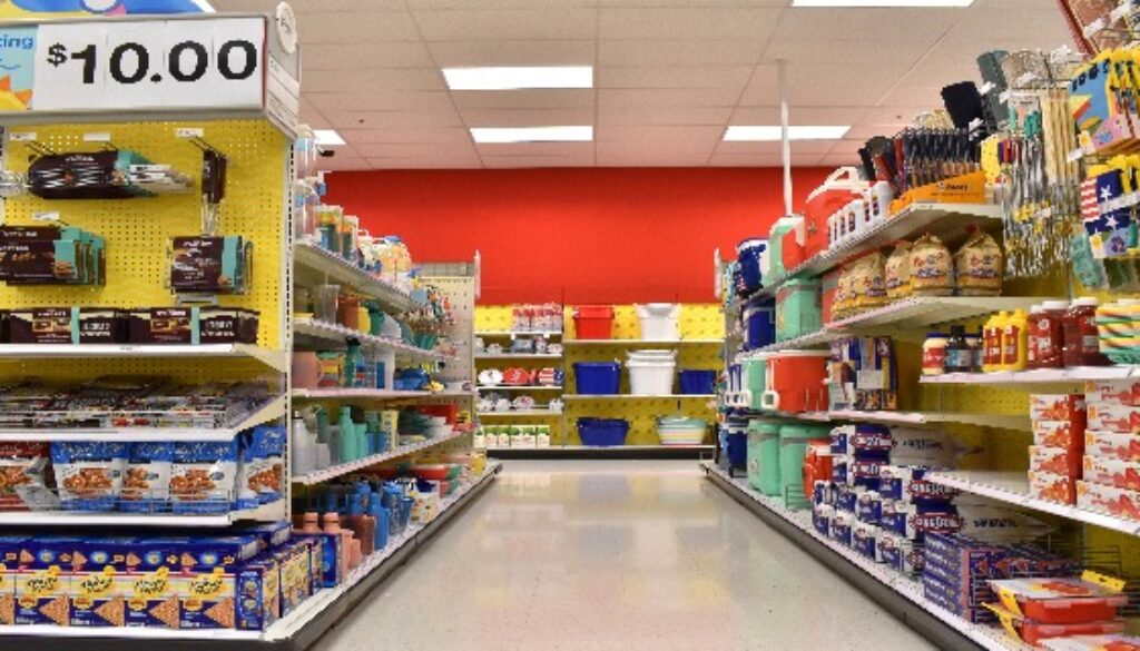
The end cap area is prime real estate and offers several advantages for your customized POP display. In regards to consumer behavior, these are some of the first displays customers see when they enter the store, and as they circle through the aisles, their eyes naturally gravitate to the end cap display.
So, how can you maximize this opportunity to your advantage? We’ve outlined some important aspects to keep in mind when creating a custom end cap display.
Before you begin: Put yourself in the customer’s shoes
To captivate your customer, you must think like a customer.
The next time you go to the grocery or retail store, observe the end cap displays. Which ones grab your attention? Ask yourself why it makes you take notice.
The most effective end cap displays take advantage of the following elements:
• Color
• Clear messaging
• Vertical structure
• Lighting
• Customization – effective displays clearly convey brand strategy
It’s only by understanding the subtleties of consumer psychology that you can strategically communicate the value of your product.
1. Follow the rule of thirds
This is one of the golden rules of art and professional photography. The theory is that the human eye naturally tends to gravitate toward certain points when looking at an object.
By dividing the area into thirds, you can easily calculate where viewers’ eyes will take them, and you should place the items of greatest interest and importance in that area.
When you create a custom end cap display, use this information to your advantage. Look at a preliminary design and “divide” it into thirds vertically and horizontally. You want to be sure your most important information is located on the “intersections” of these thirds.
Our experienced designers will be happy to discuss how placing your verbiage and products at these strategic locations can enhance your sales.
2. Utilize vertical space
For an end cap display, the banner should occupy the top space, the messaging about the product the second third, and the bottom third should be dedicated to the product. This not only establishes a clear message, but it presents an organized, polished look to the customer.
Some end caps will need to be smaller than others depending upon the space available. But don’t let that discourage you.
If you adequately take advantage of vertical space, you can easily make the most of a small amount of space.
3. Make sure customers are easily able to reach your product
When we were creating this end cap display for Milwaukee’s heavy duty tools, we knew the end cap display had to have two important elements.
First, for the end cap display installation, it had to have a way for customers to safely and securely touch the product so they would be able to feel the difference for themselves.
Second, we had to have easy access to the product to encourage a swift purchase.
You can see that we accomplished this by using a design that reserved the bottom two shelves for product while still allowing plenty of space for them to closely examine the tools.
4. Keep your end cap display stocked…but not cluttered
So often, businesses concentrate on the visual elements of the display and overlook the simple logistics. Not only do your customers have to be able to reach your product, but you have to trust your retailer that the product will be restocked regularly.
Likewise, cramming too much product in a limited amount of space will make your display look sloppy and disorganized. Make sure your instructions are made clear to your retail staff.
Don’t forget the importance of POP display storage, warehousing and distribution
While good design and customization are important, they represent one facet of the display. You have to know who will warehouse it, who will deliver it, and who will assemble it (if not delivered fully assembled).
If you don’t carefully plan for getting your end cap display to its destination, you’re in for a logistical nightmare.
The cliché rings true: Time is money. The more time your end cap display spends lost in transit means you’re losing money you could be earning in a retail store.
That’s why we offer extensive warehousing and distribution services. We know that you may need one order warehoused for later use while another order may need to arrive at a big box retailer fully assembled.
We’ll also install lighting, video components and graphics to streamline this process. We even offer a turnkey option if you’d like for the shipment to be delivered with the featured product.
McIntyre Manufacturing is your leader in distribution, warehousing, design and creation
End cap displays represent a great advantage to your business—be sure to use it to your advantage with an effective display
Creating an effective end cap display sounds overwhelming, doesn’t it? It doesn’t have to be.
We have a team of engineers who have an eye for design and technical expertise to overcome any challenges and provide the customized POP display that matches your vision.
We’re proud of our team—many of our employees have been with us for two decades—and we find nothing more gratifying than helping our clients succeed.
Our team of display rack manufacturers have helped hundreds of customers design and create captivating and award-winning end cap displays that have resulted in concrete sales increases.
We take pride in working with you step-by-step throughout the whole process, and you can rest assured it will be finished within budget and on time.
How to Choose the Best Finish for Your Display
Choosing the best finish for your point of sale display comes down to one simple question:
What invites the customer to interact with your product?
After all, a purchase involves much more than merely seeing your product—it has to create an emotional connection with the consumer. This is the key to customer loyalty.
A finish that complements your product will separate it from your competitors.
To gain perspective on how the right finish can draw attention to your product, let’s take a brief, imaginary tour of a major retailer like Wal-Mart.
McIntyre Manufacturing can create POP displays for anything from power tools to sunscreen, and “big box” stores feature a similar variety of merchandise.
Because so many products are competing with each other for the customer’s attention, it’s even more important for the finish of the display to spark an emotional connection with the consumer.
Now, follow us as we approach the store and open the door…
Attention
Soft fabrics such as sweaters are presented neatly on a table where you can easily pick one up and touch it.
Perhaps in the corner, in a display of complementary colors, there’s a line of bath spa products, presented in a bamboo-accented POP display. If you visit the home improvement area, you have extensive samples of paint “swatches” where you can easily pick them up for closer examination.
Initial impression
All these finishes work together to create an initial impression of each product.
The sweaters invite you to touch them, implying that the manufacturer has confidence in its product and welcomes closer inspection.
Natural finishes such as bamboo create an Eastern, holistic theme of relaxation—you’re likely tempted to smell one of the bath soaps.
Convenient paint swatches on “take home” paper encourages customers to interact with their product, perhaps seeing which combination of colors works best for a room renovation.
Interaction and engagement
We already mentioned the sweaters. One of the facets that make them so inviting is that the display doesn’t compete with the product. Shelves that poke out at sharp angles and a rough finish like wrinkles or hammertone wouldn’t be appropriate. Instead, the display encourages customer interaction.
Likewise, a display featuring power tools will want a finish that evokes a feeling of strength and durability. Often, a silver, metallic surface conveys this message.
There are several facets involved in selecting what’s right for your wire display rack or other display. We’ve boiled them down to four simple questions that will point you in the right direction.
What message is your product promising?
For tools and products that will undergo extreme wear-and-tear, you should likewise present a strong, smooth, sleek finish. Metal or wire customized to match the color of your logo can be an excellent choice.
By contrast, microfiber cloths beg for customers to touch them, but that message is diminished if you’re using a harsh finish.
Revisit your product’s tagline and pledge to its customers. Boil it down into one simple principle, and seek out finishes that will reinforce that.
Where will your POP display be located?
The last thing you want is for your display to be lost in its surroundings. Likewise, you don’t want it to stand out so much that it appears tacky and unprofessional.
We realize there’s always a fine line between artistry and innovation, and that’s why McIntyre Manufacturing works with clients every day to find the perfect balance to transform your vision into reality.
Our professional engineers have the technical know-how and inspired creativity that sets us apart from other manufacturers.
Does the finish encourage your customers to engage with your product?
The mantra of “look, but don’t touch” doesn’t resonate well with customers. Depending upon your product, it may be advantageous to encourage customers to pick it up and feel it. The finish of your display can go a long way toward this goal.
Don’t forget– you can even use floor decals to present the illusion of a surface such as water or wood.
If you want your customers to pick up and examine a project, such as a power tool, make sure the finish makes it easy to do so. No one wants to approach something that looks prickly with sharp edges!
When your customer engages with your product, it increases the likelihood of a purchase.
What type of finish should you use for your POP display?
It depends. There’s no one-size fits all, and we’ve worked with thousands of retail manufacturers to tailor a display to fit their needs and budget.
Regardless of the finish you select, make sure it does the following:
• Reinforces your brand
• Complements, not overwhelms, your product
• Works effectively with its environment
• Invites customer interaction
• Serves as a source of pride and professionalism
Of course, the complexities of deciding upon a finish is much more in-depth than these four questions. There are several subtleties that can affect your message that you may not have considered. Contact us for a quote on how we can help you.
McIntyre Manufacturing Provides The Team You Need for Effective End Cap Displays
The end cap display is prime real estate. When you have a chance to garner this much attention, every element counts. Whether you’re trying to decide on a finish or you’re working with vertical space, let our team of creative designers craft an incredible piece that fits your messaging and your brand.
Contact us so we can get started on your latest project.
Since 1977, McIntyre Manufacturing Group has created custom-designed displays with an uncompromised dedication to customer service. We utilize the latest technology and attention to detail to create the finest products with excellent craftsmanship. If you can dream it, we can create it. Contact us to see how we can bring


